BBFC
Redesigned a decade-old film classification system for the UK's national film regulator, solving for legacy constraints, and users ranging from digital novices to power users.

BBFC classifies films and videos in the UK by giving age ratings and content guidance to help people choose what’s appropriate to watch. I helped redesigning the film and video rating tool to view and draft reports.
Category:
Productivity tool / Compliance
My Role:
Product Designer
Year:
2019 – 2021
Team:
1 UX Designer, 1 Design Director, 1 PM, 1 Product Owner, 4 Dev
Background
As streaming platforms grow, BBFC's classification volume surged, exposing critical limitations in their 10+ year legacy system and in need for digital transformation, involving cloud infrastructure and AI assistance.

Impact
Enhanced user confidence
Designed intuitive features that boosted users' enthusiasm and willingness to explore new functionalities without additional guidance.
Successful digital transformation
Birds of Prey becoming the first film classified using the new system. Upon launching, all cinema and home entertainment submissions migrated to the new platform.
“I can’t wait to try any new features. I don't think I need any guidance when working with any new design, and would love to explore by myself.”
- Compliance Officer -

Challenges
Designing for technical extremes
User base ranged from compliance officers with 10+ years experience resistant to change, to new hires comfortable with modern interfaces, requiring a design that served both without alienating either.
No dedicated research support
Without a research team, I relied on direct stakeholder shadowing, iterative feedback sessions, and close collaboration with the product owner to validate assumptions and uncover workflow nuances.
Ambiguous success definition
Initial brief lacked clear metrics, requiring me to proactively define success indicators through stakeholder discussions and establish design principles that could guide decisions when opinions diverged.

“I have over 10 years working experiences and I'm not comfortable with changes and new technology.”
Compliance Manager

“I am new to BBFC and not familiar with the compliance rules, but I am open to new design.”
Compliance Officer
My approach
Direct user engagement
Conducted in-person shadowing sessions during actual film reviews, observing how they navigated the legacy system, took notes, and generated reports. This revealed unspoken pain points like hand switching between keyboard and mouse during time-sensitive tagging.
Iterative validation in production context
Rather than relying on abstract prototypes, I created high-fidelity, interactive prototypes using Figma and Principle that simulated actual film review scenarios, allowing stakeholders to provide contextual feedback.

User shadowing to understand how users use our product in real life.

Working with PM to understand potential user flows of submitting a report.

Studying extended scenarios, including edge cases, and solutions with stakeholders for future consideration
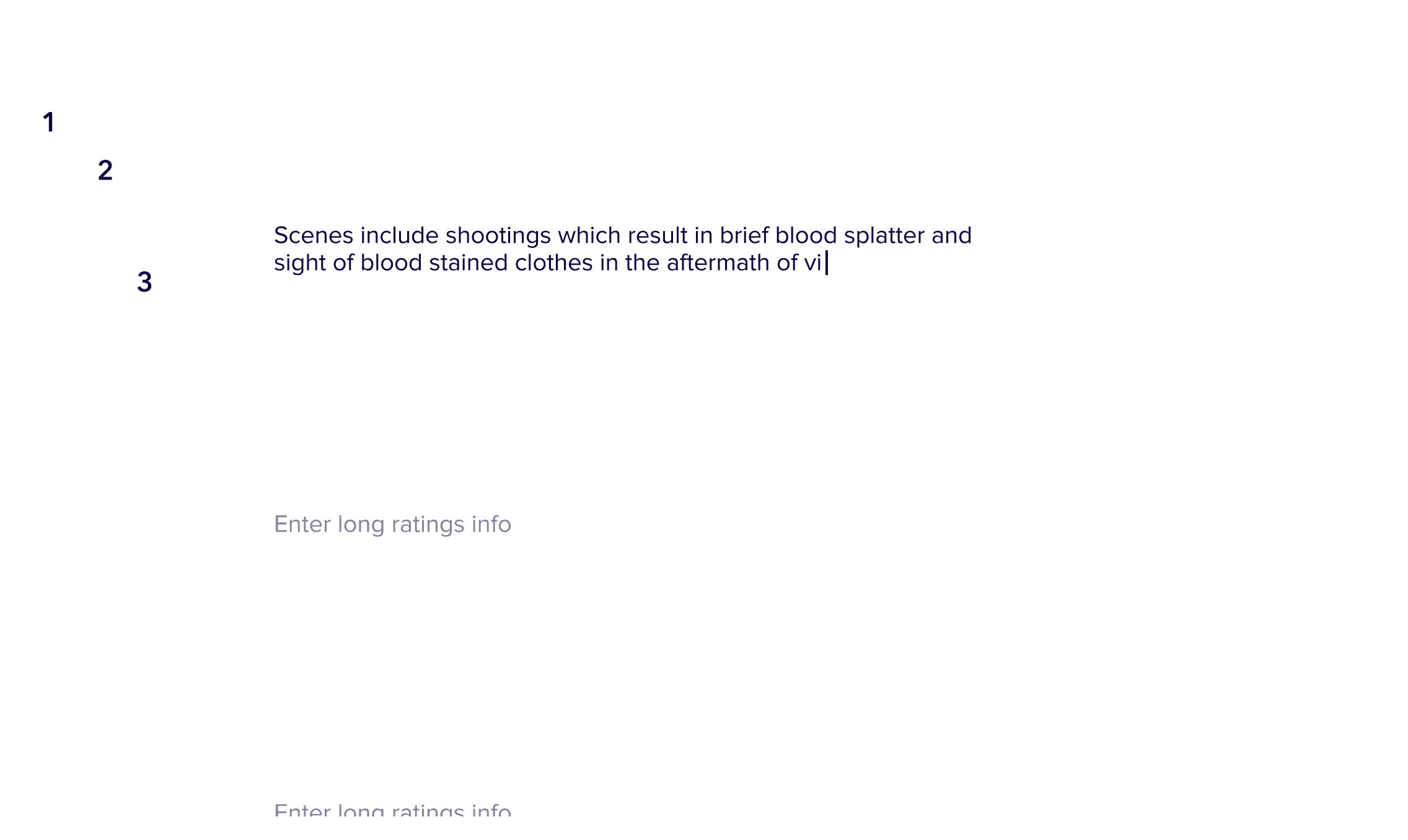
Design challenge 1 - Real-time tagging under spatial and interaction constraints
During film review, compliance officers must tag content moments with compliance keywords while the video plays.
Image on the right shows:
1) The Marker list contain keywords defining each moment.
2) Tagging panel for users to enter keywords to create a Marker

Limited space for a long list of keywords
Standard dropdown patterns failed due to space constraints and poor keyboard navigation. The solution needed to balance speed, precision, and spatial efficiency.


(left) Full screen mode, providing space for a full width tagging panel
(right) Viewing mode with video player, providing more limited space for the tagging panel
Solution - Context-aware tagging system with progressive disclosure
Optimised tagging interface
Replaced dropdown with a progressive disclosure pattern that support full keyboard navigation, adapts responsive layout, and display contextual metadata to aid decision making.
Comprehensive marker list
Designed a supporting marker list panel that serves as both a working log and reference, displaying contextual information about reasons officers tagging specific moments.

Design challenge 2 - Managing auto-generated content and information hierarchy
After tagging, the system auto-generates a Long Rating Information (LRI) report by categorizing markers into compliance sections. Officers must then review this auto-generated structure and write rationale text for each section. Problems are…
Navigation breakdown
Reports for content-heavy films could too many sections, making it difficult to locate and edit specific areas.
Trust in automation
Officers doubted the system's ability to categorise markers correctly, creating anxiety about reviewing auto-generated content.
Information density
Displaying all markers and metadata simultaneously created cognitive overload.

Solution - Progressive disclosure with manual override controls
Context preservation
Make information less overwhelming by progressively displaying info only in focus, and have the interface maintain context.
Manual editing capabilities
Allowing users to edit the list for any mistake, so as to provide flexibility to edit and on the report length.
Prototype of Report Page
Design rationale:
By making automation visible and editable, I shifted the mental model from "that might be wrong" to "smart assistant I can correct." This built user trust.
Revisiting the project
Enhance AI usage for work efficiency
Building on the insight that typing disrupts focus during film review, I explored voice-based tagging where officers could speak keywords aloud while watching.

Ideation mock up on audio tagging
Accessibility enhancement
Inclusive design for age diversity. Enhance visual clarity, extend the use of dark mode for theatre working environment, and larger interaction target.

Ideation mock up: Improving accessibility by providing clearer indication between the default and focus state, more spacious clickable area of buttons, and introducing dark mode if users need to work at a theatre room.